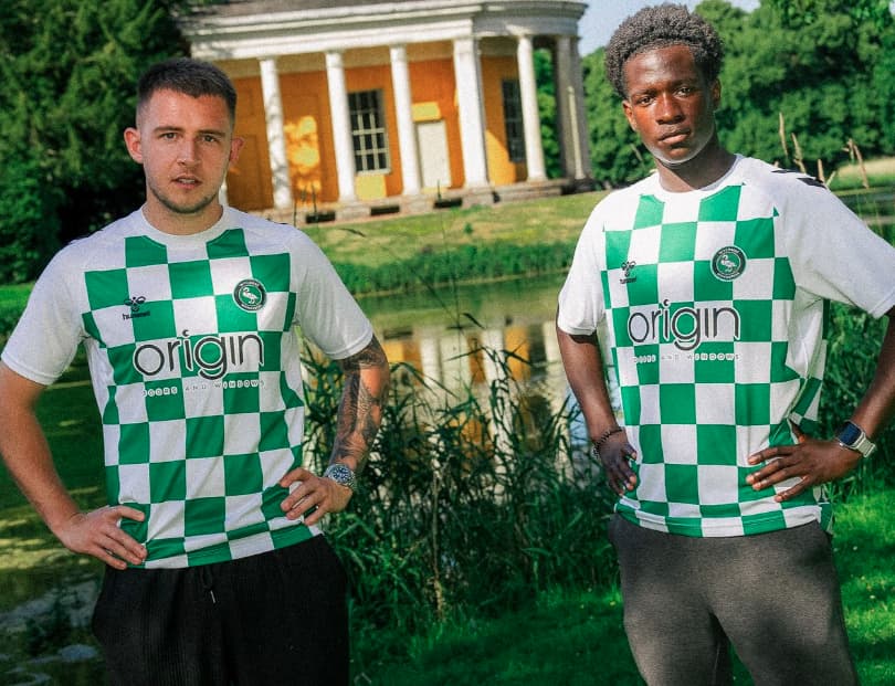
Home
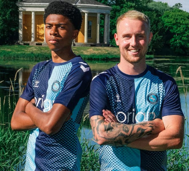
Away 1
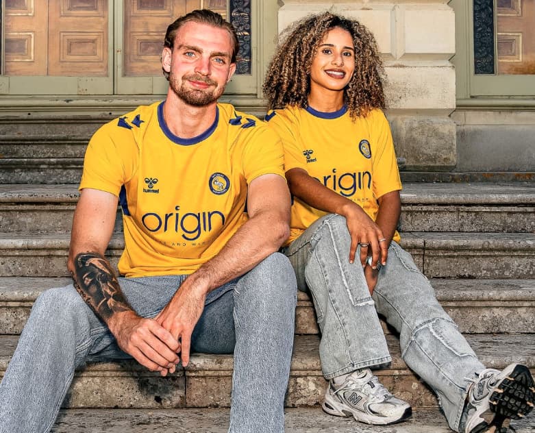
Away 2
I for one love that new home kit.
I really love that home kit, still undecided on the Away kit designs if I’m honest
Like the change strip, a decent way to jazz up the classic greens.
Home kit I am unbothered by. Neither love nor hate.
Yellow… I’m not a fan
Mildly interesting that all 3 are being pitched as 25/26 kits, suggesting that we will now have new kits every summer.
Didn’t they do this 2yrs ago and we went around and around discussing this?
There are always going to be changes here and there, like add the Uni onto the back near the collar or a sleeve sponsor
New shop as well, not on sale yet.
I like the yellow kit the most
Can’t decide if I like the home kit or if it’s made out the same material as a mesh sports bag
Maybe they finalised them during the last heatwave and thought they players needed additional cooling holes?
Yellow kit is the best for me. Home kit makes my eyes go funny if I stare at it too long.
I quite like them all tbh
Without wishing to sound all bah humbug, I’m not mad on any of them. Much prefer clean quarters with no messing around. Have never liked our yellow change kits, anything white or black appeals more. Green and white Croatia is something a bit different but meh. All horses for courses and I’m sure I’ll get over it.
Interesting they didn’t use Kone as one of the models. Suspect they don’t expect him to be wearing any of them…
He’s going for £10m to Wrexham…according to ‘X’. ![]()
I’m guessing that they didn’t / don’t want to make the same mistake as several years ago, I believe it was the last kit from O’Neills where 2 or 3 of the players that were modelling the kit left that transfer window but the club kept using their photos to advertise their kit
Home - not sure at the moment, but I think it will grow on me, like the big swan one and the venetian blind one.
Change - quite like it, nice traditional 70s/80s style design, nice colours.
Third - not over keen. Bit of a random design. Nothing Wycombe-like about it at all.
Wish we could have a second quartered kit, and also a white one with light and dark blue trim, as many people have suggested on here previously.
Choosing the club captain and the recent big signing to model the kits is hardly the start of a conspiracy theory.
"Oh yes, let’s look like Mansfield Town, said no-one, ever.
Another pointless, completely unnecessary third kit."
I’m fine with pointless unnecessary third kits, but yeah, why just come out with a Mansfield home shirt?
Reminds me of the time we went with a Torquay knock-off design.
Don’t like the green and white one at all, I get that we did a reissue of the old green and white pyjama kit, but no idea why we kept those colours a second time.
Yellow and blue are perfectly fine Wycombe colours.
I really like the home. It may be unusual to sacrifice the alternating sleeves, but it gives it a sleek look to have both dark blue. Still undecided on Vegan Croatia, though.