It’s not one of our best designs
Beautifully understated!
If only it was
1 Like
The comment, not the shirt! But you’re calling my bluff, I suspect.
Something like that.
1 Like
I will make the current shirt last for two seasons as it was meant to do
9 Likes
Good call Alan. These new shirts are horrible.
I personally don’t like it at all as people have said reminds me too much of the nightmare that was Alan Smith. A quick straw poll amongst.
My learned colleagues in the Frank Adams showed actually more or less a 50-50 split in opinion even amongst older supporters. I suspect it’s aimed at the younger fans the proof of the pudding will be how well it sells. I do appreciate that they have to come up with something different every year it’s the world we live in now. I will continue to wear my 1930s retro rugby style shirt which has served me well since the 1990s
Indeed, it is older than most of the players
I like it!
I mean, the Quarters have been adapted in the past.
Personally, I liked this combo of kits. Others will hate it. That’s the way it goes.
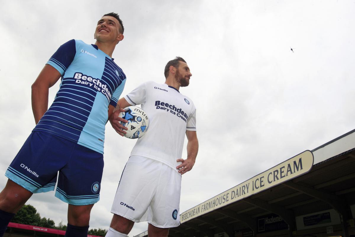
It’s growing on me.
We’ve had some really creative kits that felt like good options. The Swan embedded, the double set of quarters, the one in your example. Then this year’s one. But the new kit just feels a bit oddly non symmetrical and too jazzy at the moment. Time will tell how it will go down. Wasn’t 100% keen on this year’s one at first bit it grew on me.
1 Like
Now I have calmed down a bit about the kit, I’ll give some (slightly) more constructive feedback….
The new kit would probably be fine as a training kit….its not too late to pivot guys….
The last one messed around with the quarters too much for my liking but at least it was done with some level of design creativity.
This one looks like someone found a clip art drawing of lightning bolts and just stuck those on.
What’s most disappointing is that Hummel have created some absolute bangers of shirts all across their port folio in recent years. I’m sure they can’t get everyone of them right, but this one is such a misstep it hurts.
Does Lommy have some electrical company subsidy under his wing that will be named as our main sponsor? Because I am trying to figure out the clubs reference to the “electric” home kit.
Has someone missed the brief and thought our colours we royal and “electric blue” rather than Oxford and Cambridge blue?
1 Like
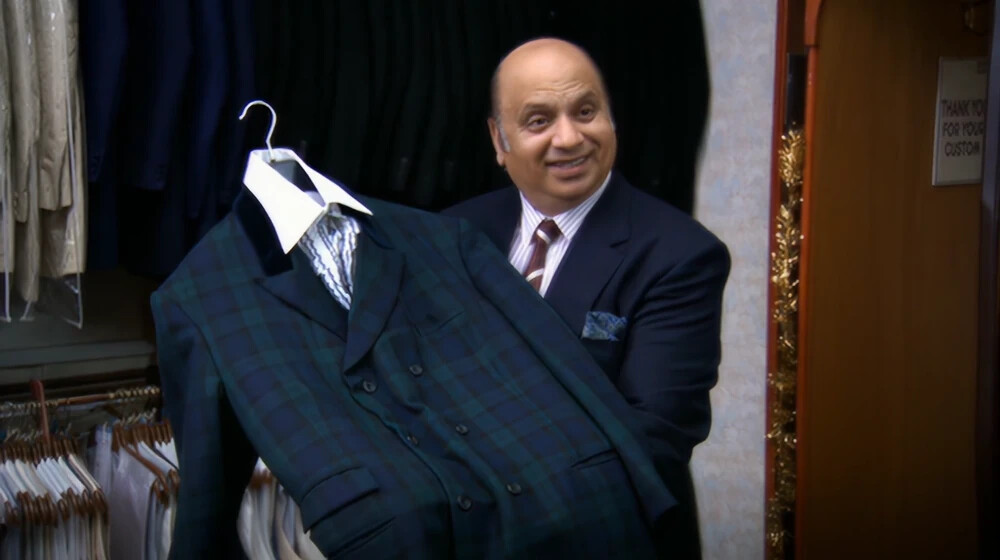
I like it and more importantly for me my kids love it. It’s unlikely I’d be buying one for me but way more likely they’ll have one each. 
1 Like
It’s not up there with one of the greats is it… I do t mind a little bit of thinking outside of the box with the quarters… I actually really liked this seasons shirt.
New one is a bit naff. However as others have said, kids will love it. I showed my boys, the think it’s “Sick”. ..
I think I might be if I stare at the zigzags for too long!
1 Like
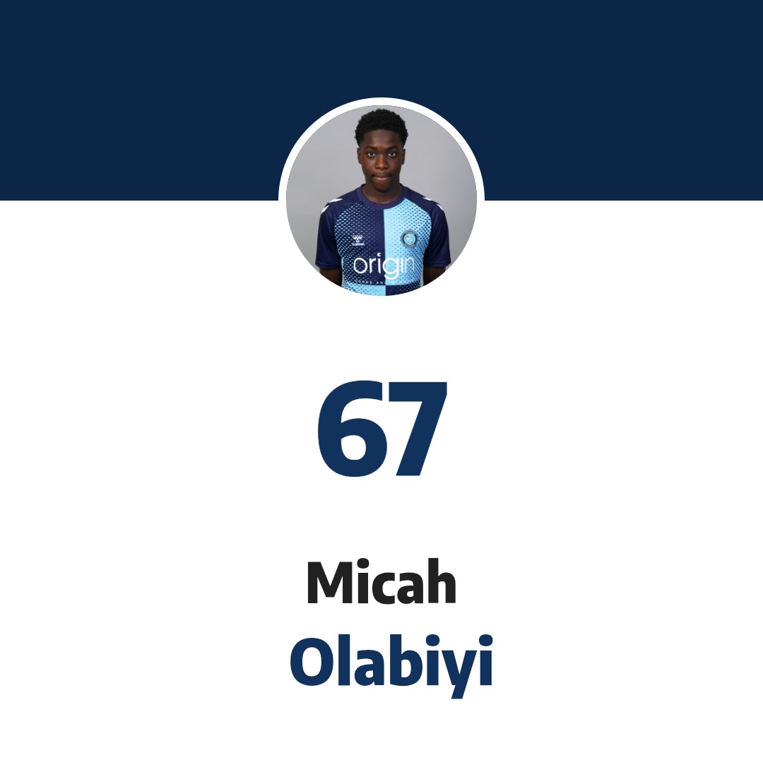
Not going to lie, make that into a print and the kids would love that more than anything else the club could push…….but shhhh, don’t tell Disney 
A widely held opinion.
Better be quick. It might be 9 next season.
Just a jest. BF made it his yesterday.
Oi oi oi you can’t claim him as your boyfriend now just because he’s scored one!
1 Like