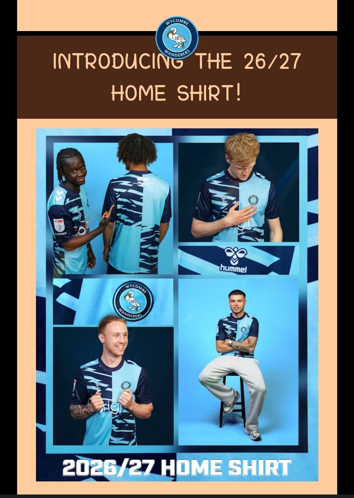
Meh.
Is that as bad as Alan Smiths? Probably not but the worst one in donkeys…
Meh.
Is that as bad as Alan Smiths? Probably not but the worst one in donkeys…
At least it’s not red and white
It’s right up there for me.
Certainly fits in the “has absolutely nothing to do with the history and traditions” of the club category.
Its a football shirt, it looks fine. I’ve seen worse.
Origin must be delighted to sponsor a shirt that looks like a broken window
I dont know what to think of it to be honest, leaning more towards not liking it
Utter dog shite. Just give us what everyone wants. Quarters. Plain fucking Quarters.
Looks like a shirt someone would design/accept as a design in an effort to end an agreement under breech of contract conditions.
Yep, definitely had the feeling of oh uh Alan Smith era shocker of a shirt for me. I’ll give it a better look at the beginning of next season when the hope comes back..
Looks like someone has been at it with scissors or the dark blue has discoloured in patches
Think I preferred one that was designed by the kids the other week.
Having said that. Buying Day 1 so 
Horrendous kit. Who thought that up?
Thank goodness we’ve moved to a new kit every season. Only 365 days til hopefully something decent.
The only thing we can hope for is that it is actually the winning design in a secret competition for under 10’s
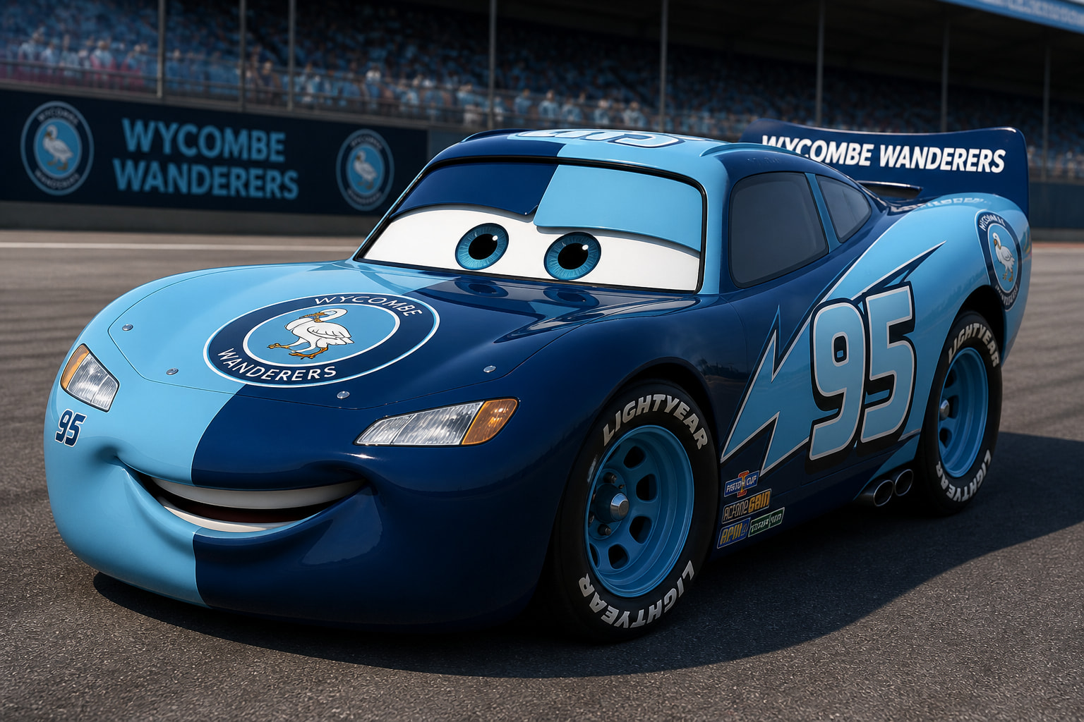
Then I could understand why it’s got Lightning mc-fucking-queens lightning bolts on it.
Kachow.
Can’t wait to see who selects squad number 95
If we win the league next season will be fondly remembered as our best ever 
So bad. Trying to rip off the la media inglesa shirt and failing horribly.
My new iPad background
That is one of the most abysmal shirts I have ever seen. As bad as the Smith one. Hideous. Problem is that having to do something different with the quarters every single season means the chances of such abominations increase.